A while ago I received an invitation from Little Greene to visit their stand at the Woonbeurs, get to know more about this brand and pick out four samples from the new colour collection called “Highlights”.
“These beautiful ‘new’ colour combinations were created using natural earth pigments and often contained black, given a muted quality that is generally associated with what we believe to be ‘true’ historical paint shades, even though this soft quality was frequently the result of aging on the painted surface rather than the authentic, intended hue.”
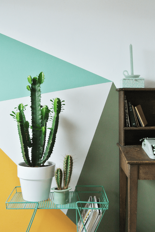
With “Dare with Colour”, Little Greene challenged a couple of bloggers to give their own interpretation of their new collection. I picked out the colours Marigold, Green Verditer, Shallows & Sage Green and decided to combine three of them together in a graphic pattern on the wall. These three colours are not the most obvious combination but I think they work very well together! If you would use these colours separately, they would show a completely different look.
This challenge fitted me perfectly because I love to use colour in my home, especially as highlights! If you want to see or read more about the Highlights collection and Little Greene, click here!


Pictures by Marij Hessel


5 replies on “Little Greene: Dare With Colour!”
Renae
It looks fantastic. Love the shapes and angles!
Ilse den Besten
It looks so fun!
Liza Veenendaal
Ik vind het prachtig geworden!
Eigenhandig
Wat een lekker kleurtjes! Heel mooi verwerkt samen in het patroon.
Liefs,
Eigenhandig
Elizabeth @ Awesome Wave
Love those colours and the geometric pattern. I'm thinking of doing something similar when I get back to having my own office space at home.